Introduction
I’m excited to take a first look at the redesigned Settings app in the latest version of iOS. As an iPhone user, the Settings app is one of the most important and frequently used apps, so any changes to it are noteworthy. In this in-depth review, I’ll take a comprehensive look at what’s new, what’s changed, and how the redesign impacts the overall user experience.
Visual Redesign
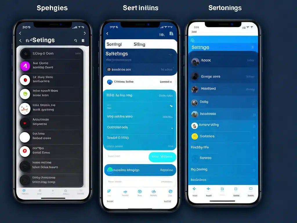
The most immediately obvious change is the visual redesign. Overall, the aesthetic is cleaner and more streamlined.
Some key changes:
-
The sidebar navigation categories are now bolder and more clearly separated. This makes it easier to scan and quickly jump between settings pages.
-
There is more whitespace and less clutter. Things feel less cramped overall.
-
Icons and symbols are used more frequently instead of plain text. For example, the Wi-Fi and Bluetooth toggles now display signal symbols rather than the words “Wi-Fi” and “Bluetooth.”
-
Headings are larger and more visually distinct.
Overall, these visual tweaks help modernize the aesthetic and improve scanability. The Settings app feels more fresh and intuitive.
New Settings Categories
In addition to the visual refresh, there are also changes to the sidebar navigation categories:
-
A new Apple ID banner at the top consolidates all account-related settings in one tap. This provides quick access to critical account management features.
-
The Home category offers personalized suggestions for settings you may want to adjust. This is handy for surfacing commonly accessed settings.
-
Passwords and Privacy categories provide more transparency into security and privacy controls.
By adjusting the categories, Apple makes key settings more discoverable for users. Critical features are easier to access.
Enhanced Individual Settings Pages
Within each settings page, there are also notable improvements:
-
More consistent structure and formatting across different pages. For example, the layout of the Wi-Fi and Bluetooth pages is now nearly identical.
-
More detailed explanations and guidance for settings. Certain advanced options now include direct links to support articles for learning more.
-
Added “i” buttons provide extra context without cluttering the screen.
-
Certain settings like Notifications and Sounds & Haptics use more graphics and interactive elements.
These enhancements make adjusting individual settings simpler. Users get clearer explanations and more customization options.
Siri Suggestions
One entirely new feature is Siri suggestions. Based on your usage patterns, Siri may now proactively recommend tweaks to certain settings like:
- Enabling Low Power Mode when battery is low
- Turning on Do Not Disturb while at certain locations
- Adding Home Screen pages for apps downloaded recently
This automation helps surface relevant suggestions precisely when they may be useful. It’s a major step forward in making settings self-optimizing.
Final Impressions
After closely inspecting the updated Settings app, I’m impressed by the scope of improvements. While fundamentally familiar, the redesign feels modern, approachable, and optimized for simplicity. The cleaner aesthetic, reorganized categories, and enhanced detail on individual pages add up to a smoother user experience. Features like Siri suggestions point to a smarter, more personalized future for managing settings. For an app as central as Settings, this first look gives me confidence in the direction Apple is headed.


