Introduction
I was eager to check out the new Windows 11 operating system after it was officially released in October 2021. As a long-time Windows user, I was curious to see how the user interface had evolved in this latest version. In this article, I’ll share my first impressions of the Windows 11 UI based on using the OS for a few weeks.
Visual Design
The most obvious change in Windows 11 is the visual design. Microsoft has softened the square edges and given the OS a more rounded aesthetic.
Rounded Corners
Windows, icons, context menus, and other elements now have rounded corners, giving the UI a more modern, sleeker look. The flat, boxy edges of Windows 10 are gone. Personally, I really like this change as it feels more refined.
Centered Taskbar
The taskbar is now centered on the screen by default instead of left-aligned. This is more Mac-like and visually balances the bottom of the screen.
I don’t love the centered taskbar, so I changed mine back to left-aligned which you can easily do. But I can see the centered placement appealing to some users.
New Icons
The built-in app icons like File Explorer, Mail, Calendar, and Photos have been updated with a new, more minimalist design. They look cleaner and more modern.
I’m a fan of the new icon designs as they fit well with the new visual style. The icons perfectly combine simplicity and recognizability.
Dark Mode Improvements
The Dark mode option is substantially improved in Windows 11. Now, the taskbar, Start menu, and other elements use a true black rather than just dark gray. This gives it a more seamless, sophisticated look.
The darker dark mode is much easier on the eyes and feels more integrated into the OS rather than just an add-on theme.
Overall Aesthetic
Microsoft has clearly aimed for a cleaner, visually calmer OS. There’s more whitespace and less clutter. Animations are smooth and refined. The overall effect is a more polished, Mac-like aesthetic.
For me, the changes elevate Windows visually and make it feel more modern and competitive with other operating systems. It retains usability while looking sharper.
Start Menu
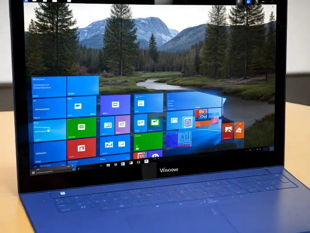
The Start menu has received some of the most notable changes in Windows 11. Let’s look at the key updates.
Centered Layout
Just like the taskbar, the Start menu is now centered on the screen instead of left-aligned. All the tiles and icons fill the middle portion.
This gives it a cleaner look, but reduces the usable space a bit. I prefer having app icons on the left and more room for big tiles.
No Live Tiles
The animated Live Tiles from Windows 10 are gone. Now all apps are represented by their logo icon, like in tablet mode before.
Some users will miss Live Tiles, but I don’t mind their removal. The static icons have a tidier, less distracting look.
Recommended Section
The Start menu now has a Recommended section at the top showing your most commonly used apps and files. This provides quick access to frequently used items.
I find this section genuinely useful. The recommendations automatically populate based on my usage and saves me time clicking through menus.
Redesigned Layout
Overall, the Start menu layout has been streamlined and decluttered. There’s more whitespace and it focuses on simplicity rather than dense information.
For me, the changes improve visual clarity, though some power users may prefer the more information-packed layout of Windows 10.
Multitasking
Windows 11 introduces some useful new multitasking capabilities. Let’s look at the key upgrades.
Snap Layouts
When you hover over the Maximize button on a window, you’ll now see Snap Layout thumbnail options for different window configurations like side-by-side.
This makes setting up split window multitasking much faster and more intuitive. I’m already using Snap Layouts daily.
Snap Groups
You can now group windows together in a Snap Group. Hover over a Snap Layout thumbnail and choose “New snap group” to anchor windows together.
Snap Groups make managing and accessing multiple windows far more efficient. It’s a major upgrade for multitaskers.
Desktops
You can now create multiple virtual Desktops and easily switch between them. I keep Chrome windows on one Desktop, productivity apps on another, and communication apps on a third.
This allows you to separate work, personal use, and other contexts without having to open and close windows. It’s one of my favorite new features.
Widgets
Windows 11 introduces widgets – small apps that provide information at a glance like news, weather, and calendar.
To access widgets, click the Widgets icon in the taskbar or swipe from the left side of the screen. A widget panel will slide in with various customizable mini-apps.
I like having quick access to things like weather, to do list, and headlines without needing to open full apps. Widgets feel like a refined version of what existed in Windows Vista.
However, I wish Microsoft included even more widget options out of the box like calculator, dictionary, translations, and more.
Table Comparing Windows 10 and Windows 11 UI
| UI Element | Windows 10 | Windows 11 |
|-|-|-|
| Taskbar Alignment | Left | Centered |
| Start Menu Alignment | Left | Centered |
| Live Tiles | Yes | No |
| Icons | Solid color | New minimalist |
| Dark Mode | Dark gray | True black |
| Rounded Corners | No | Yes |
| Snap Layouts | No | Yes |
| Widgets | No | Yes |
Conclusion
Overall, I’m impressed with the visual and multitasking upgrades in Windows 11. The UI feels more modern, refined, and competitive. Key additions like Snap Layouts, Snap Groups, Desktops, and Widgets significantly improve ease of use and productivity.
There are some controversial changes like the centered Taskbar and Start menu, but these are easy to customize. For me, the positives of the redesigned interface far outweigh any negatives.
Microsoft has done an excellent job evolving and polishing the Windows UI without losing usability. I’m happy with my upgrade to Windows 11 and look forward to increased performance optimizations over time. The new user interface feels like a welcome and necessary step forward for Windows.


