Introduction
I recently upgraded to Windows 11 and one of the most noticeable changes is the redesign of File Explorer. As someone who uses File Explorer daily to manage files and folders, I wanted to share my first impressions of the updated user interface and functionality.
Visual Redesign
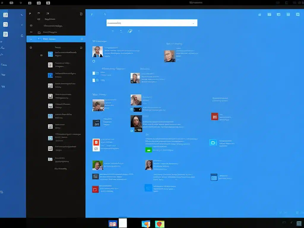
The most obvious change in File Explorer is the visual refresh. The user interface adopts the same cleaner, more modern aesthetic seen across Windows 11.
Some key aspects of the redesign:
-
The left navigation pane has been cleaned up with icon-only navigation instead of text labels. This gives it a more streamlined look.
-
The ribbon menu at the top has been removed in favor of a simplified toolbar with just basic commands like cut, copy, paste, etc. This toolbar also collapses when not in use to maximize screen space.
-
Icons, right click menus, and other elements like the search bar use rounded corners and muted colors that align with Windows 11’s style.
-
There are also new folder icons that look nicer and make different folder types easier to distinguish at a glance.
Overall, I find the new interface much more visually appealing. It feels lighter and makes better use of screen real estate. The simplified options also help focus on core tasks.
Tabbed Browsing
One of my favorite new capabilities is tabbed browsing in File Explorer. Just like a web browser, you can now open multiple Explorer tabs within the same window.
Tabs make it so much easier to reference and copy files between different folders. I no longer have to open separate Explorer windows, resize them, and drag between them. I can just click a new tab and instantly switch locations.
I also like that I can drag tabs out into their own windows if I need to see multiple locations side-by-side. Overall, tabs bring a huge improvement to my workflow.
Customization Options
Windows 11 adds helpful options for customizing File Explorer to match my preferences.
For example, under the View tab, I can:
-
Choose whether to show tabs or open folders in a separate window
-
Opt to show more details like file size and date modified
-
Adjust icon size and spacing
-
Toggle various interface options on/off like the preview pane
It’s nice having more granular control over the interface. I appreciate being able to tweak File Explorer’s layout to best suit each task.
Rounded Corners and Mica Material
Two visual touches that help modernize File Explorer are the rounded corners and Mica material used in the background.
Rounded corners give all windows and menus a softer, more refined appearance. This shows up everywhere from the search bar to context menus.
Mica is Microsoft’s transparent acrylic material that adapts to your desktop background. It adds a subtle texture and helps File Explorer’s floating windows stand out less from the wallpaper.
These details add up to a much more polished and visually cohesive experience. File Explorer finally looks like it belongs as part of Windows 11.
Remaining Gaps
While the redesign is excellent overall, there are still a few gaps I hope to see improved in future updates:
-
Customization – More options to control the look and feel would be nice, like adding small icons to the navigation pane.
-
Tab management – Basic tab management like reordering, pinning, and closing tabs feels clunky right now.
-
Consistency – Some menus like the context menu still use the old style instead of matching Windows 11.
-
Power user features – Some advanced functionality hasn’t been modernized yet and feels dated.
However, Windows 11 is still new and I expect File Explorer will continue evolving. The core of the redesign is excellent.
Conclusion
The visual overhaul and addition of tabbed browsing drastically improve the day-to-day usability of File Explorer. The interface feels modern, clean, and powerful.
There are still areas for refinement, but overall Microsoft nailed it – the File Explorer redesign is one of my favorite Windows 11 features so far. It will make file management much more seamless and enjoyable.


