Introduction
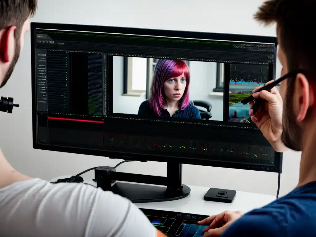
Color correction and grading are crucial skills for any video editor or filmmaker to master. Getting the colors just right in your video or film can have a huge impact on the overall look, feel, and quality of your project. In this guide, I will share my insights and experience with color correction and grading to help you gain a deep understanding of this complex craft.
Whether you’re editing a corporate video, wedding film, independent feature, or YouTube content, understanding color can take your videos to the next level. Subtle changes to the colors and contrast in the image can elicit strong emotional responses from viewers. The ability to match shots and create stylistic color grades gives you immense creative control over the look of your film. Mastering color correction and grading takes practice, but learning a few key concepts and techniques can help you get powerful, professional results.
Understanding Color Theory and Color Models
To really take control over the colors in your video, you first need to understand some basics about color theory and color models.
Color theory examines how colors interact with and relate to each other. It looks at concepts like color harmony, color psychology, and the emotional impacts of certain color palettes. As a video colorist, you need a grasp of color theory fundamentals in order to make intentional, meaningful color grading choices for your video projects.
Color models provide a precise, mathematical way to represent colors numerically. There are a few main color models used in video production and post-production:
- RGB – Used for video signals and images displayed on your computer screen. Combines red, green, and blue light to create a wide gamut of colors.
- YUV – Stores color information similarly to RGB but is the primary color model for broadcast television standards.
- CMYK – Used for print design. Combines cyan, magenta, yellow, and black ink.
- HSV – Represents colors based on hue, saturation, and value/brightness. Useful color model for making adjustments.
Having a solid grasp of these color models and how to convert between them is essential for professional color correction and grading.
Matching Shots and Correcting Errors
One of the primary tasks of color correction is to match different shots so they have a consistent look. Even if you shot with the same camera in the same lighting, you will likely have inconsistencies between shots or angles. The lighting may change slightly, the auto exposure and auto white balance respond differently, or shots may look completely different due to being filmed on different cameras.
As the colorist, it’s your job to analyze the shots and make adjustments so that the colors and exposure match between clips. Here are some best practices:
- Use the waveform monitor and vectorscope to objectively compare clips and identify differences in exposure and color balance.
- Make basic adjustments first, before starting to grade creatively. Correct major errors and discrepancies.
- Use the RGB color curves or RGB color wheels to precisely adjust the balance of the shadows, mid-tones, and highlights between clips.
- Carefully adjust saturation and luminance of key colors if shots have inconsistent color casts.
- Check skin tones. Use color warper tools to color match faces, if needed.
- Double check matching by eye on a properly calibrated, large monitor. Go back and refine adjustments until shots match.
Taking the time to correctly match and balance all of your shots will give you a solid, unified base before you start grading stylistically.
Setting Contrast and Mood with Grading
Once you’ve done your technical color correction, you can start the creative color grading process. Stylized grading gives you an immense amount of control over the contrast, color palette, and overall mood or tone of your video.
Some key aspects of color grading include:
-
Contrast – Increasing or decreasing overall contrast in the shadows and highlights. Higher contrast usually feels more intense, dramatic and moody. Lower contrast looks softer, more subdued.
-
Color palette – Emphasizing certain hues, saturating or desaturating the colors overall. Colors can evoke different emotions in the viewer.
-
Tone – Cooler, blue tones can feel melancholy or clinical. Warmer, orange tones feel cozy or nostalgic. Sepia and monochrome are classic looks.
-
Vignetting – Adding darkened edges or corners focuses the viewer’s attention.
-
Film looks – Emulating the color timing of film stocks like Kodak or Fuji.
Take time to experiment with different grading options to find a look that matches the style and mood of your video. Use techniques like power windows and secondary corrections to grade specific parts of the frame differently.
Proper Signal Flow for Accuracy
To get the best results from your color correction and grading process, you need an optimal signal flow – the path the video signal follows through your software and hardware. Proper signal flow allows you to monitor and adjust colors with maximum accuracy.
Here are some signal flow best practices:
-
Calibrate your monitor – Use a probe like Spyder or i1Display Pro to calibrate your editing monitor for accurate colors.
-
Enable broadcast safe colors in software like DaVinci Resolve or Premiere Pro to avoid illegal broadcast colors.
-
Work in a high bit depth like 10-bit or 12-bit color to avoid banding artifacts.
-
Use proper codec – Work with an editing codec like ProRes or DNxHD, avoid highly compressed codecs until final output.
-
Only apply grading adjustments to properly decoded source files – Do not apply looks at the end of the pipeline without proper source footage decoding.
-
Test on multiple displays – Check colors on other calibrated monitors, TVs, and devices to ensure adjustments translate accurately across different displays.
Following these steps will help you perfect your signal flow and enable you to maximize the accuracy and polish of your color work.
Achieving Cinematic Film Looks
Many video editors and directors want to emulate the look of classic cinema in their projects. Thankfully, modern color grading software makes this possible. Here are some tips for achieving a cinematic film look:
-
Softer contrast – Films often have a gentle roll-off in the highlights/shadows vs a harsh video look. Try medium contrast S-curves.
-
Film color science – Use film stock emulation LUTs or color wheels based on film colors like Arri Log-C.
-
Film grain – Add back in subtle random grain to mimic the texture of celluloid.
-
Creative color grades – Use strong, bold color grades inspired by iconic films. Think teal/orange or Coen Brothers looks.
-
Anamorphic lens flares – Add Cinemascope style lens flares and other optical imperfections.
-
Vignette – Slight darkened edges as seen in many classic films.
-
Letterboxing – Top and bottom bars to frame the image in widescreen cinematic aspect ratios.
With these techniques and a strong understanding of color theory, you can help give your videos a truly cinematic grade.
Conclusion
Color correction and grading may seem intimidating at first, but learning some key theories, techniques, and software can help you master this crucial craft. Proper color can elicit emotions, set tone, and take the visuals in your video projects to the next level. Use the concepts explored in this guide as a roadmap for improving your color correction and grading skills over time. With practice and an artistic eye, you’ll be able to enhance the cinematography of any video project through the power of color.


