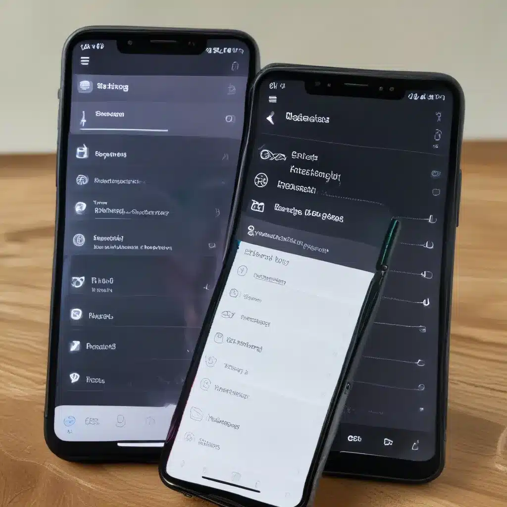
Upgrading the Settings App: A Much-Needed Overhaul
After what feels like an eternity, the macOS Settings app is finally getting a much-deserved facelift. And let me tell you, it’s about time! As someone who’s been using Macs since the days of System 7, I’ve watched the Settings app evolve (or rather, not evolve) over the years. It’s like that old pair of jeans you refuse to get rid of, even though they’re two sizes too small and have more holes than fabric.
According to the folks at BasicAppleGuy, the Settings app, or as it’s been known for decades, System Preferences, has been around since the earliest days of Mac OS X. And in all that time, it’s remained stubbornly unchanged, save for the occasional new preference pane being crammed in.
Bringing Coherence Across Platforms
One of the biggest frustrations with the current Settings app is the lack of coherence between macOS and iOS. As 9to5Mac reports, the iOS 18 Settings app is getting a major overhaul, with a reorganized and simplified experience. Meanwhile, the macOS Settings app has been stuck in the past, diverging significantly from its mobile counterpart.
Imagine if you had to go to four different places to manage your Apple ID, Family Sharing, and internet accounts on your Mac, while on your iPhone, it’s all neatly tucked away under a single tab. That’s the kind of disjointed experience we’ve been dealing with, and it’s high time for a change.
A Modern, Streamlined Approach
The redesigned Settings app for macOS, as envisioned by BasicAppleGuy, looks like a breath of fresh air. Gone are the outdated icons and the cluttered, scatter-brained layout. In its place, a sleek and modern interface that borrows heavily from the iOS Settings app.
The new Settings app features a sidebar with all the setting areas on a scrollable panel that expands to the right. This not only modernizes the look and feel, but it also brings the macOS experience closer to what users are familiar with on other Apple platforms. No more hunting through multiple preference panes to find what you’re looking for.
Streamlining the User Experience
One of the biggest improvements in the redesigned Settings app is the way it handles software updates, storage management, and subscription management. Instead of having these features scattered across various menus and tabs, they’ve all been consolidated into a new “About This Mac” section at the top of the Settings app.
Gone are the days of navigating through the Apple logo, then to “About This Mac,” and then to the “Storage” tab to manage your storage. Now, it’s all right there in a single, unified pane. And with the addition of software update and AppleCare management, you’ve got all the essential system information and controls in one convenient location.
Unifying the Desktop Experience
Another significant change in the redesigned Settings app is the way it handles desktop-related settings. As BasicAppleGuy points out, macOS has matured to the point where a unified “Desktop Settings” pane makes a lot more sense than having those features scattered across multiple preference panes.
Now, you can change your desktop wallpaper, adjust display brightness, and even tweak your Dark Mode settings, all from a single, streamlined interface. No more hopping between the “General,” “Desktop & Screen Saver,” and “Displays” tabs to get your desktop just the way you like it.
Modernizing the Bluetooth Experience
The Bluetooth settings have also gotten a much-needed facelift in the redesigned Settings app. Gone are the cluttered and outdated menus, replaced with a more intuitive and visually appealing interface.
Instead of a sea of tiny icons and cryptic labels, the new Bluetooth settings feature large, easy-to-read device information, complete with status indicators and quick access to connection and management controls. It’s a vast improvement over the current Settings app, which can feel like navigating a labyrinth when you’re trying to connect a new Bluetooth accessory.
A Promising Step Forward
Overall, the redesigned macOS Settings app is a promising step in the right direction. By bringing the experience closer to what users have come to expect on iOS and other Apple platforms, the Settings app is finally getting the attention it deserves.
Of course, a complete overhaul of such a critical system component is no small feat, and there’s no doubt that the transition will come with its fair share of challenges. But if Apple can pull it off with the same level of polish and attention to detail as they’ve shown with the iOS 18 Settings app, then I for one can’t wait to see the finished product.
So, if you’re like me and have been longing for a more modern, streamlined, and coherent Settings experience on your Mac, then get ready for a big change. The future is bright, and it’s all coming to a Settings app near you.
Now, if you’ll excuse me, I think it’s time to finally retire those old jeans and embrace the sleek, modern style of the redesigned Settings app. Who knows, maybe I’ll even treat myself to a new laptop from https://itfix.org.uk while I’m at it!


