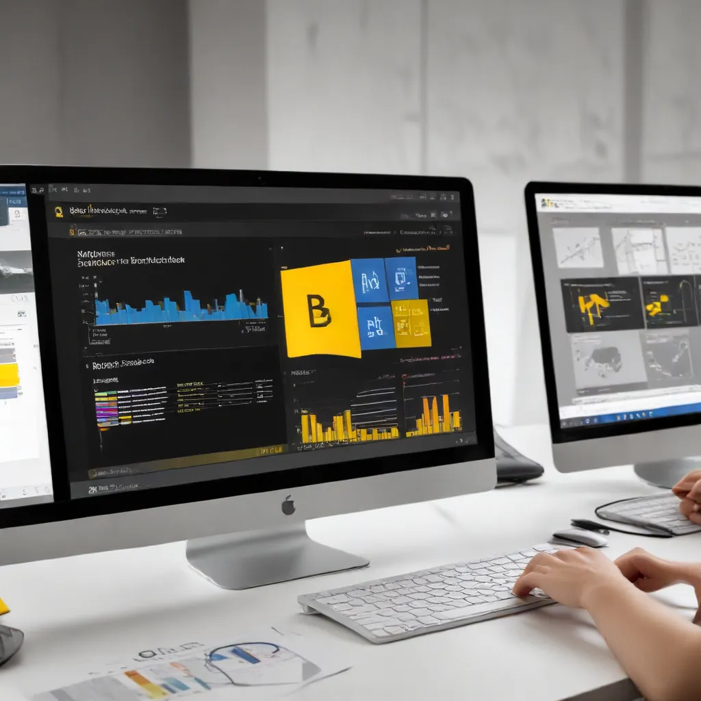
Unleashing the Power of Visualization in Statistical Analysis
As a seasoned IT professional, I’ve witnessed the transformative impact of data visualization in the realm of statistical analysis. One such powerful tool that has revolutionized the way we approach power and sample size calculations is the visualization-driven approach. In this comprehensive article, we’ll delve into the intricacies of this effective tool, exploring its benefits, key features, and practical applications in the IT field.
Understanding the Importance of Power and Sample Size Calculations
In the world of statistics, power and sample size calculations are crucial components of any robust research or analysis. Statistical power refers to the likelihood of a statistical test detecting an effect when it truly exists. Essentially, it represents the ability of a test to avoid a Type II error, where a true effect is present but not detected.
On the other hand, sample size is the number of observations or data points required to achieve a desired level of statistical power. Determining the appropriate sample size is vital to ensure the validity and reliability of your findings, as well as the efficient use of resources.
Introducing the Visualization-Driven Approach
Traditional methods of power and sample size calculations often involve complex mathematical formulas and can be daunting for non-statisticians. However, the visualization-driven approach offers a more intuitive and user-friendly solution. By leveraging the power of data visualization, this tool enables IT professionals, researchers, and decision-makers to navigate the intricacies of statistical analysis with ease.
One such visualization-driven tool is the Tableau Software, a leading data visualization platform. Tableau’s intuitive interface and interactive visualizations make it an ideal choice for exploring power and sample size considerations.
Key Features of the Visualization-Driven Approach
-
Interactive Visualizations: The visualization-driven tool, such as Tableau, presents power and sample size calculations through dynamic and interactive visualizations. These visuals allow users to explore the relationships between various factors, such as sample size, effect size, and statistical power, in a more intuitive and engaging manner.
-
Real-time Adjustments: Users can manipulate the input parameters, such as the desired power level or expected effect size, and observe the immediate impact on the sample size requirements. This real-time feedback enables informed decision-making and facilitates the optimization of study designs.
-
Graphical Representations: The visualization-driven approach typically displays the power and sample size calculations using intuitive graphs, charts, and plots. These graphical representations make it easier to interpret the results, identify trends, and communicate findings to stakeholders effectively.
-
Collaborative Capabilities: Many visualization-driven tools, including Tableau, offer collaborative features that enable multiple users to access, analyze, and share the power and sample size calculations. This collaborative approach fosters knowledge sharing and facilitates cross-functional discussions within the IT team or organization.
-
Accessibility and Ease of Use: The user-friendly interface and visual-centric design of the visualization-driven tool make it accessible to a wide range of IT professionals, even those with limited statistical expertise. This democratization of power and sample size calculations empowers non-statisticians to actively participate in the analytical process.
Practical Applications in the IT Field
The visualization-driven approach to power and sample size calculations holds immense value for IT professionals across various domains. Here are a few examples of how this tool can be leveraged:
-
Software Performance Testing: When evaluating the performance of IT systems or software applications, power and sample size calculations are crucial to determine the appropriate number of test cases and ensure the statistical validity of the results.
-
Network Infrastructure Analysis: In the context of network performance optimization, the visualization-driven tool can help IT teams determine the necessary sample size for network traffic analysis, ensuring that the collected data is representative and sufficient for accurate decision-making.
-
Cybersecurity Risk Assessment: When assessing the effectiveness of cybersecurity measures, the visualization-driven approach can assist IT security professionals in determining the appropriate sample size for penetration testing or vulnerability assessments, enabling them to make informed decisions about resource allocation and risk mitigation strategies.
-
User Experience (UX) Evaluation: In the realm of UX design and testing, the visualization-driven tool can support IT professionals in calculating the necessary sample size for user studies, usability testing, and A/B experiments, ensuring the statistical robustness of the insights gained.
By integrating the visualization-driven approach into their analytical workflows, IT professionals can unlock a new level of efficiency, collaboration, and decision-making power, ultimately driving better outcomes for their organizations.
Empowering IT Professionals with Visualization-Driven Insights
The visualization-driven approach to power and sample size calculations has revolutionized the way IT professionals tackle statistical analysis. By leveraging the intuitive and interactive features of tools like Tableau, IT teams can now navigate the complexities of statistical analysis with ease, making informed decisions that optimize resources, enhance system performance, and drive innovation.
As an experienced IT professional, I encourage you to explore the power of visualization-driven tools and incorporate them into your analytical arsenal. By embracing this innovative approach, you can elevate your IT solutions, streamline your decision-making processes, and ultimately position your organization for greater success in the dynamic and ever-evolving digital landscape.
Remember, the IT Fix blog is here to support you on your journey, providing practical insights and in-depth guidance to help you navigate the ever-changing world of technology. Stay tuned for more informative articles that empower you to harness the full potential of data-driven tools and techniques.


